


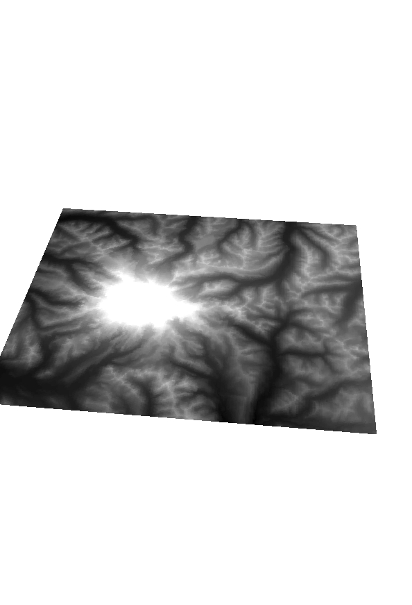
Above is a 3D rendition of the 780 foot floodplain similar to the lowest picture down at the bottom.


Above are some floodplain maps for the campus area of Eau Claire, notice the difference in water cover from the flood heights of 780-800 feet.
_________________________________________________________________________________

Check out the above map, it shows Landslide event in Forest Falls where the river reclaimed the path it used to carry before human intervention diverted the path to the east.
Need one more Image from Lab 7. Need Book.
___________________________________________________________________________________

Check out this map I quickly threw toghether. It displays total volume loss from the Mt. St. Helens erruption. Notice the loss of mass where the lateral erruption occured. All units in Cubic Yards.


What you can see above is the before (bottom) and after (top) images of Mt. St Helens in regards to the eruption in the 80's. Notice the loss of a true peak, as well as how the eruption seems to be lateral instead of purley vertical.

________________________________________________________________________________
Lab 5 Image


__________________________________________________________________________________

Above is my cool map! As the Legend states, the Red signifies a county that is in the top 5 of all coountries in terms of Volcanic Activity. Notice that the little orange triangles correspond along the plate boundaries showing how Volcanoe (triangles) occur along fault lines (red outlines).
______________________________________________________________________________

__________________________________________________________________________________

___________________________________________________________________________________
 |
This map file depicts a drought forecast for the midwest during the summer month of June. It takes an Engineering paradigm approach to mitigating natural hazards. As you can see the south-western corner of the map is by far the most prone to droughts in the month of June. However, the border between Wisconsin and Northern Michigan cannot be ignored, nor the Duluth area of Minnesota. In order to take a complexity approach farmers and agriculture based operations would need to look at the growing season forecasts. Each month would need a drought forecast and Farmers would need to start stocking up on water for the driest months while lessening watering during the wetter months. They could also find ways of storing the precipitation that falls during wet months, if there is an excess, and saving it for use during the drier months. It's hard to avoid a drought as it's a complicated set of climactic events, but there are ways to better 'interact' with the hazards associated with droughts.
When taking the game seriously I decided to
build lots of houses that were better than just bamboo huts. I built some brick
and stone buildings and tried to set them on high ground far away from the
island. I also decided to build defenses of all sorts in and near the low
areas. I built an emergency sensor off the coast and lots of sand dunes and
water breaks as well. On the grass I elected to plant as many trees as possible
and also planted mangroves in the shallow water. I built two hospitals in the
farthest place from the coast and a school in the middle of both of them. _______________________________________________________________________________

One thing I could have done better was upgrade
my hospitals and community center. I didn’t realize that was an option so I
overlooked it. I wasn’t able to warn the citizens very well but mostly they all
seemed to make it out ok.
My strategy for killing off as many of the people possible was to simply provide bamboo huts along the coast line. I tried to build as many bamboo huts in the beach and on low lying areas. I also elected NOT to build any hospitals. I build a school and apartment complex on the beach too in hopes of luring idiot peoples to the coast. I made sure to demolish the existing defenses like coral reefs and sand dunes to eliminate all sorts of protection.


No comments:
Post a Comment